

Interbrand | Packaging Design
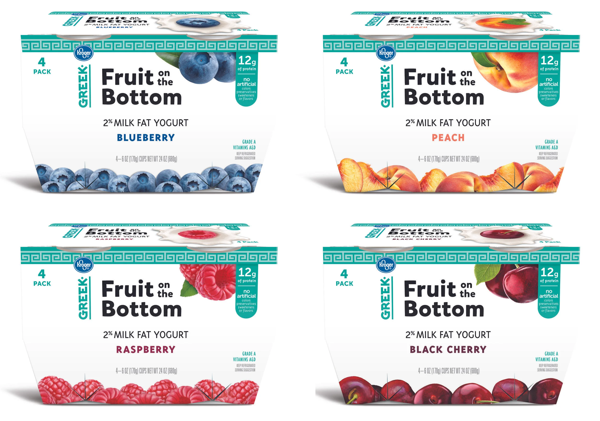
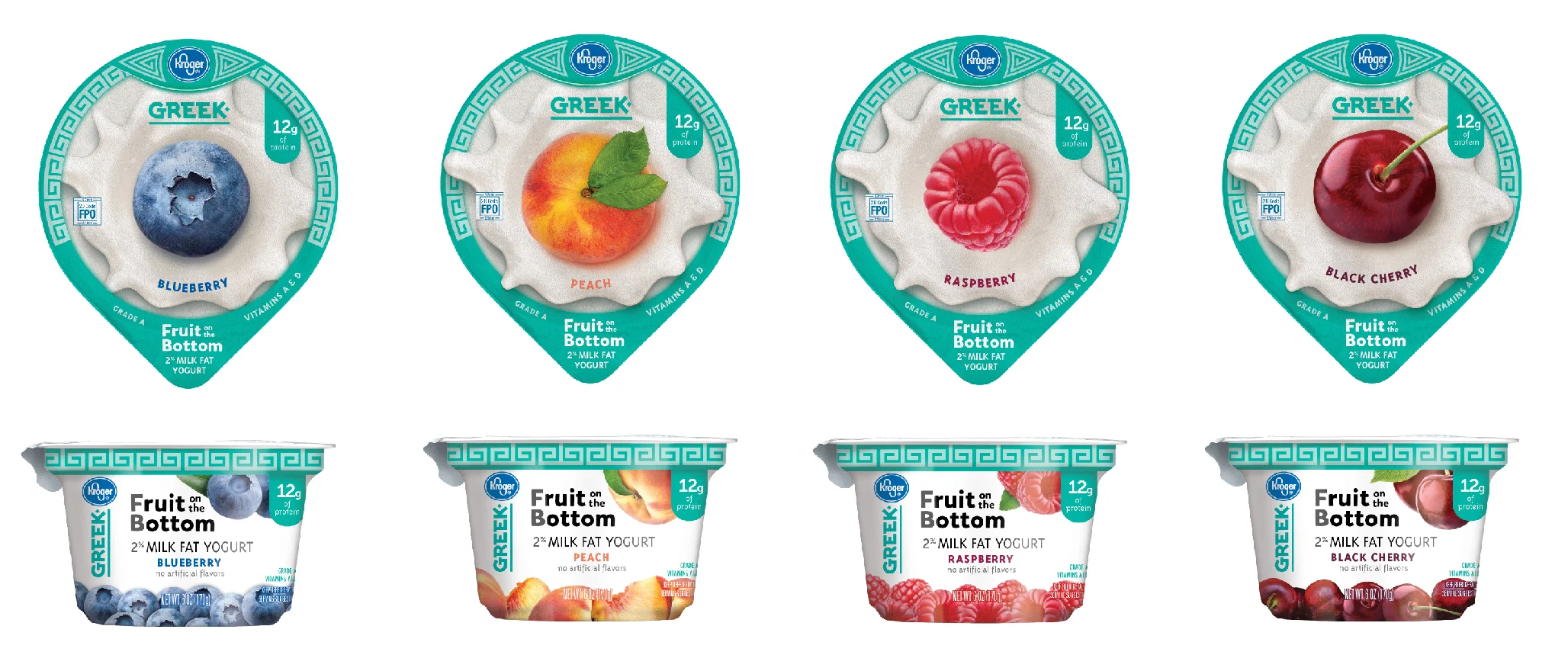
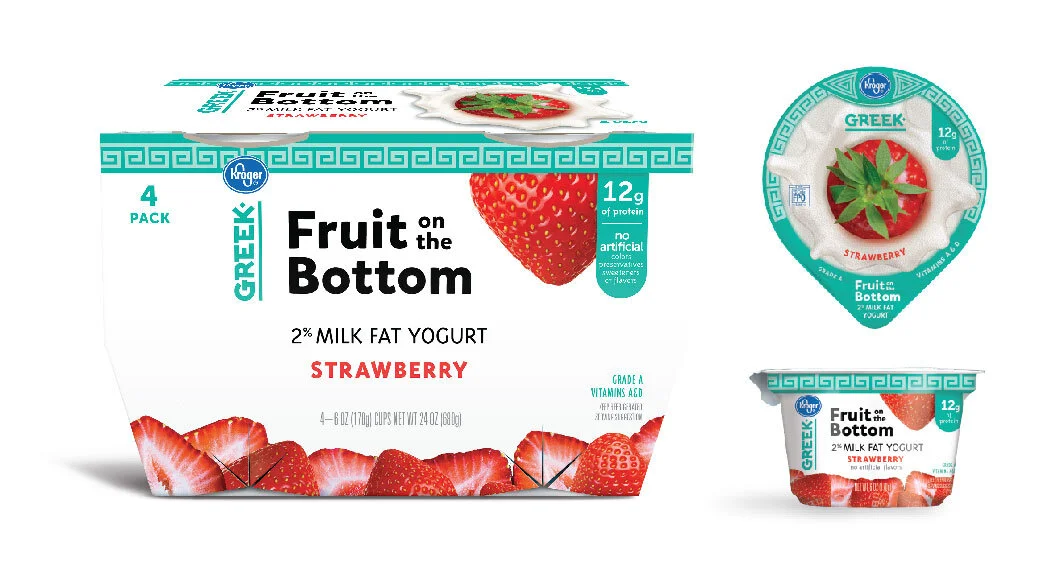
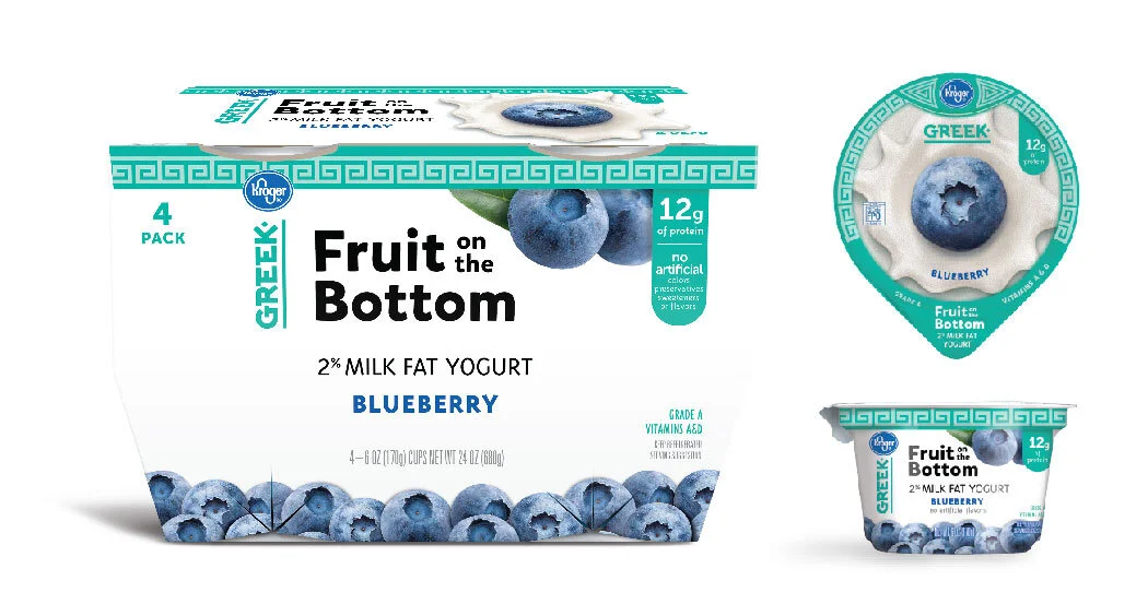
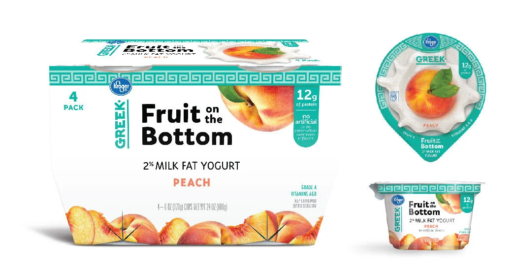
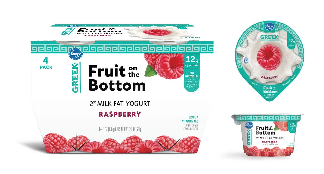
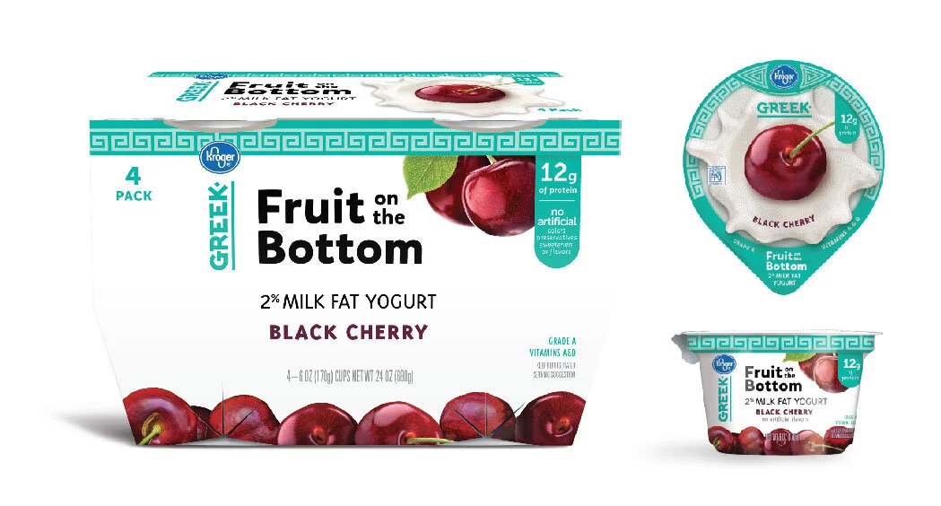
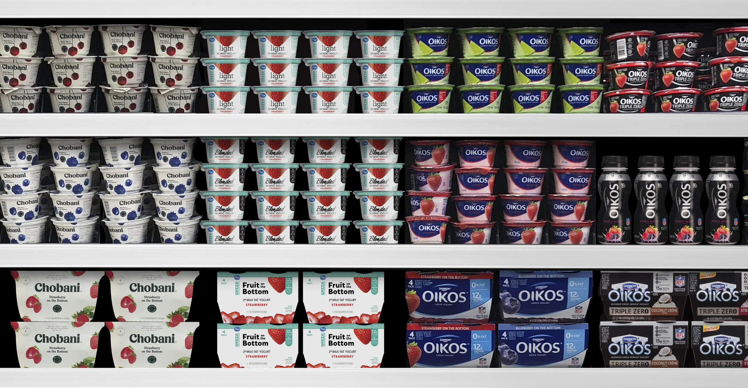
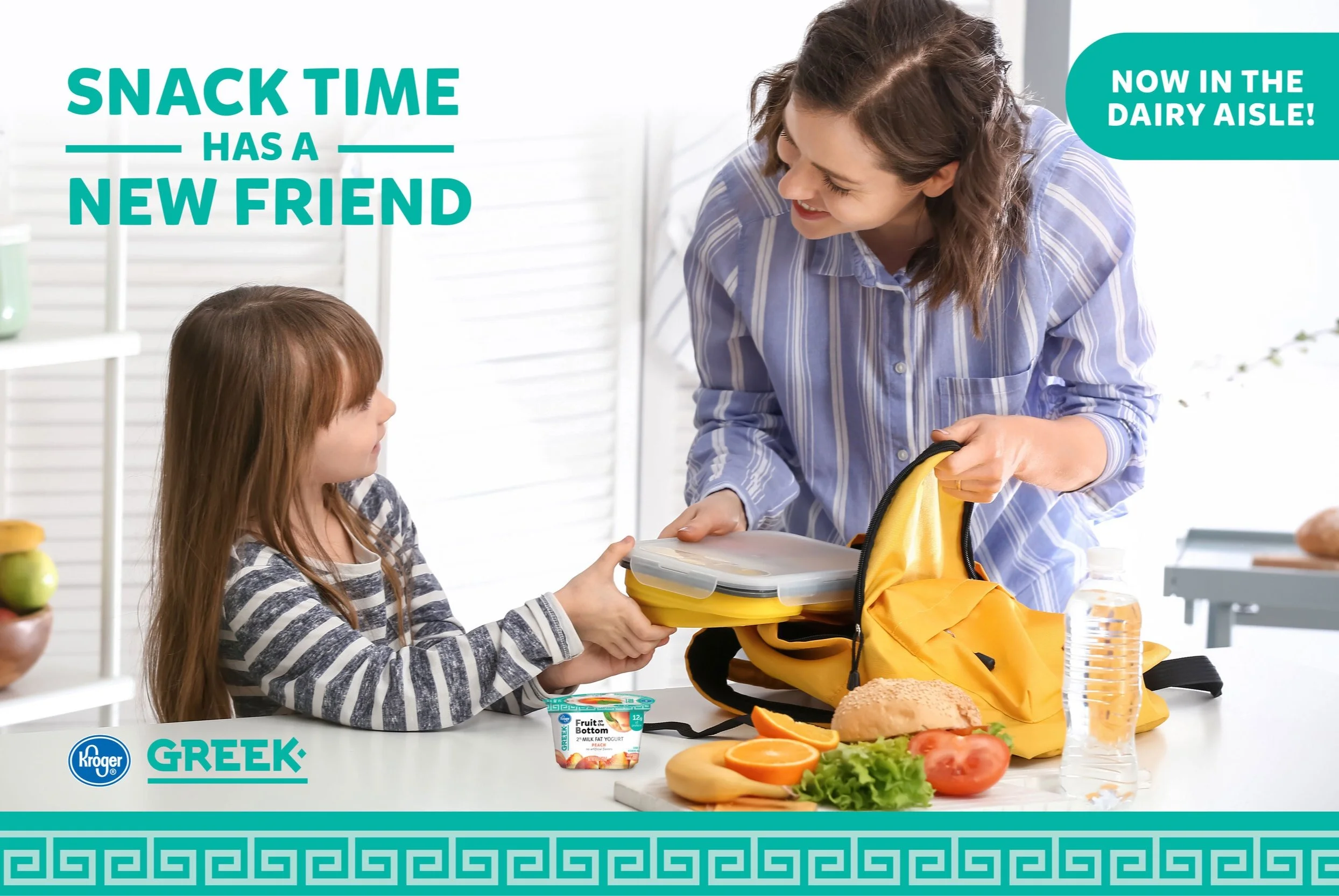
Kroger added a new yogurt line to their portfolio and needed an identity that made it stand out next to competition on shelf. The design had to entice the customer to purchase the new line of yogurt while clearly explaining what is inside. Appealing fruit photography for each flavor advertises the new offering while displaying fruit literally on the bottom of the packaging.
Solution
Greek-like graphic elements are used to accentuate the yogurt splash and fruit in the center of the lid. The outside of the cup gives a clear hierarchy of what the product is, and also demonstrates what to expect inside with the fruit on the bottom.
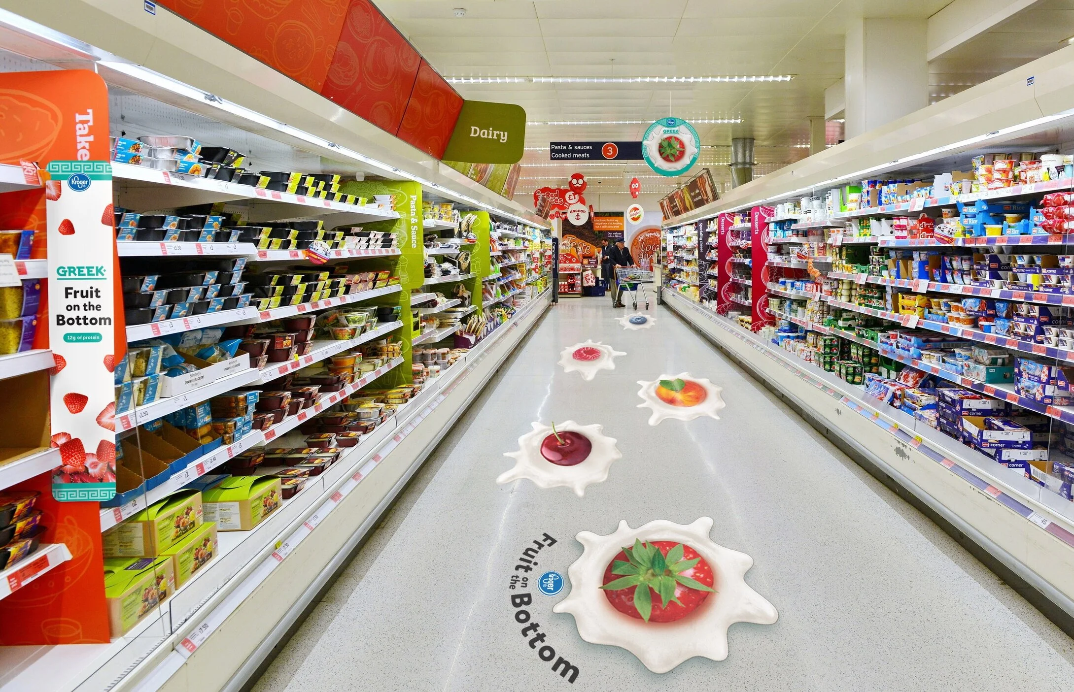
in store activations
Because other fruit on the bottom products existed in competitors, the challenge was to create a friendly brand that customers would want to try over other products they’ve had before.
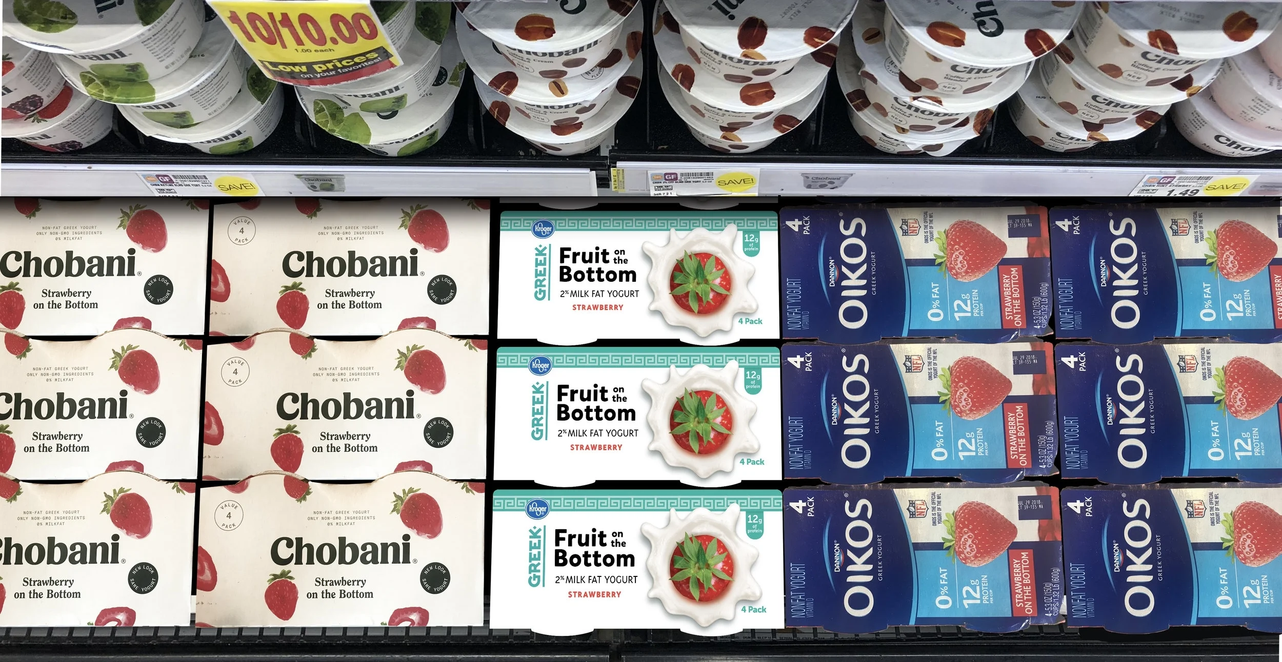


excited is an understatement: Part 2 😍
Nothing is better than seeing your work complete and on shelf!