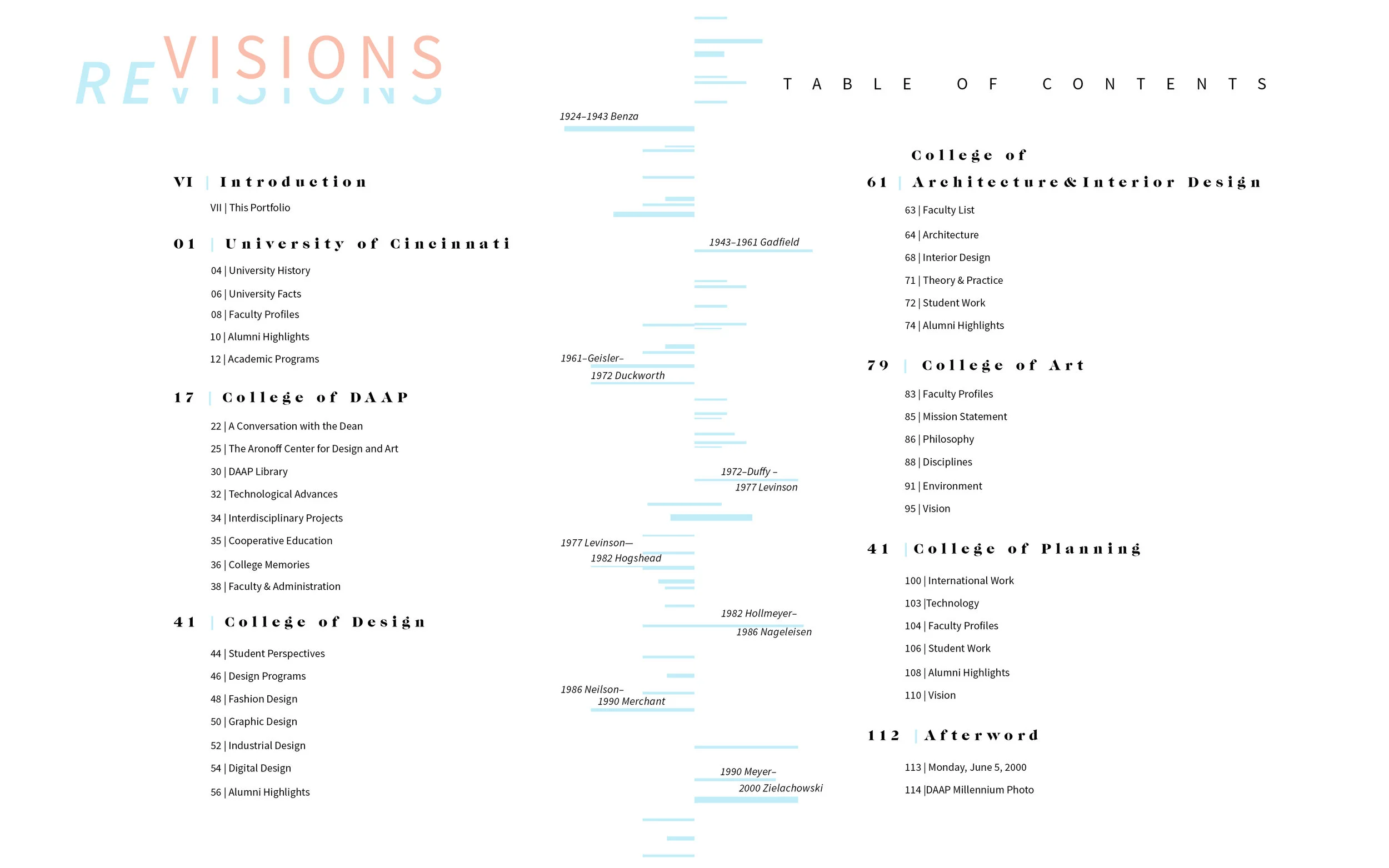
Publication Design
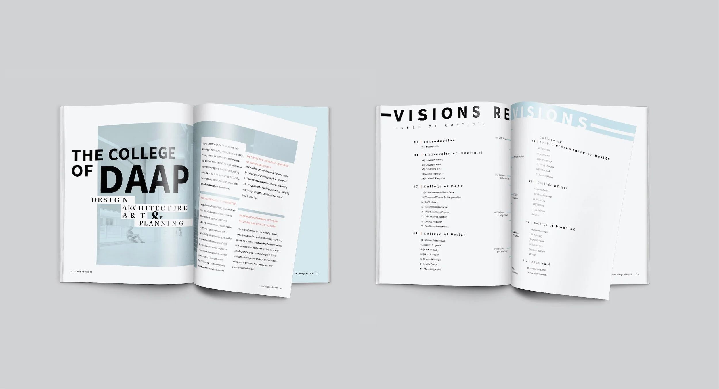
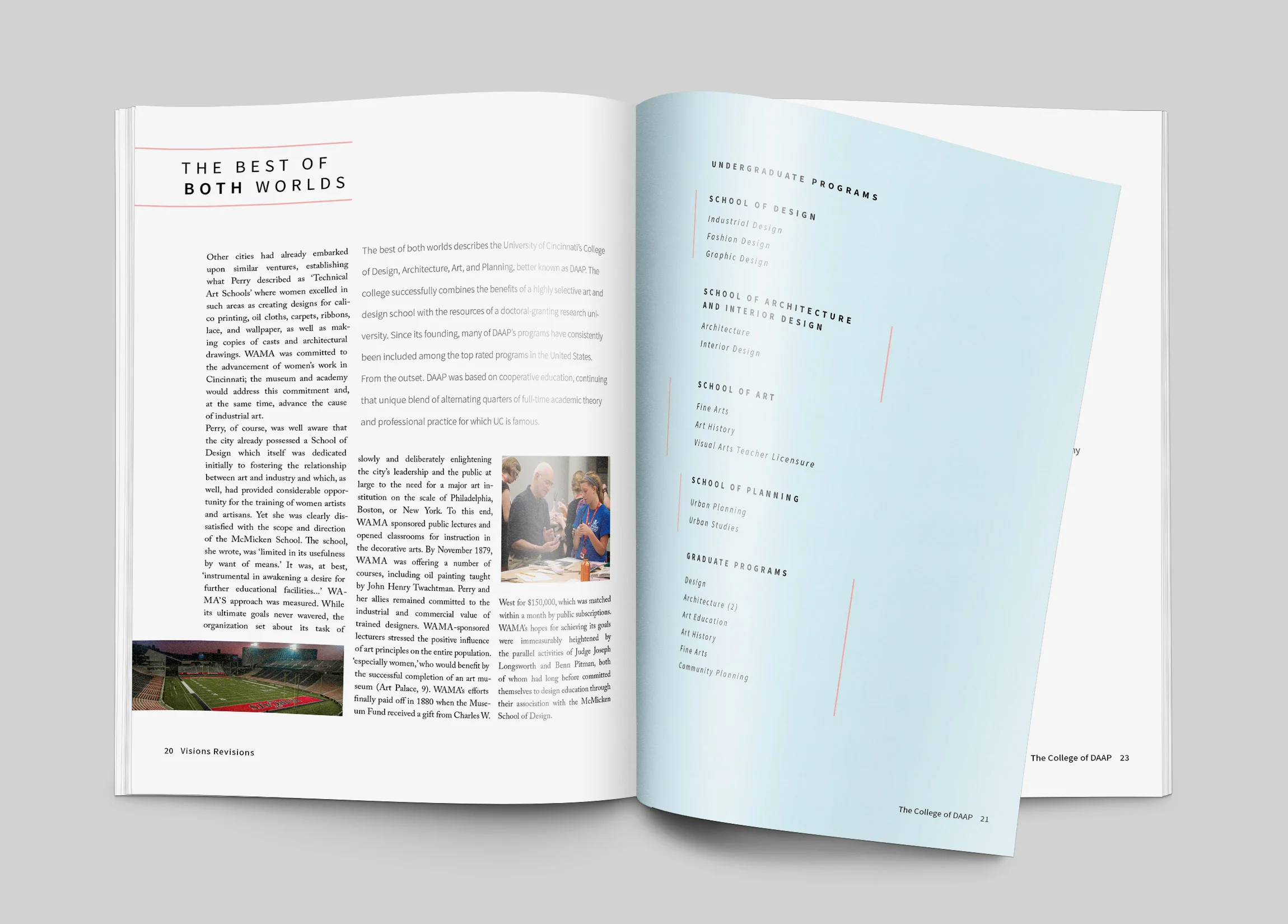
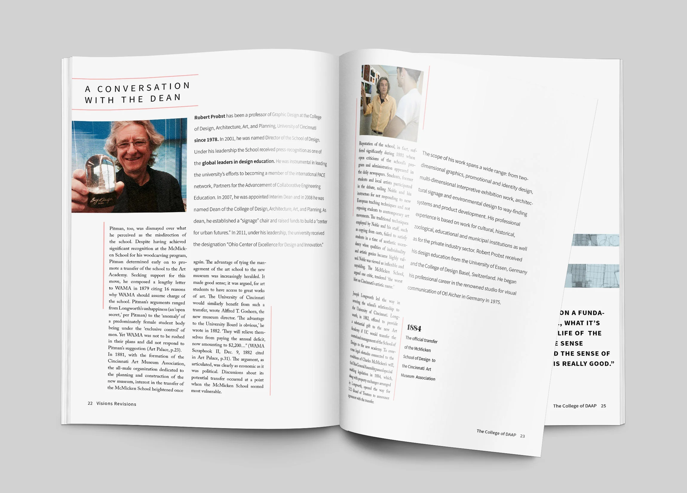
I collaborated with a classmate to update the Art section of DAAP's publication of Visions Revisions. We determined the publication's audience is past, current, and future design students. The solution is based on the connections and growth that students experience during their time at DAAP. The color palette chosen represents the shades of blue and pink that are found throughout the school, while the typography creates texture and provides continuity throughout the publication.
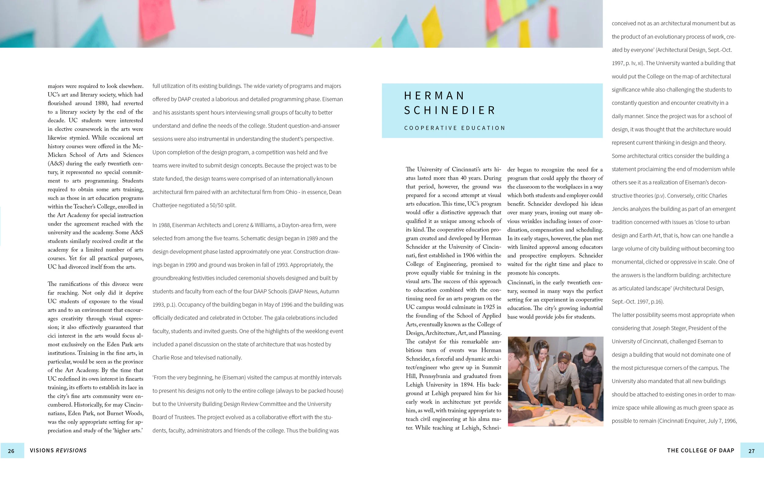
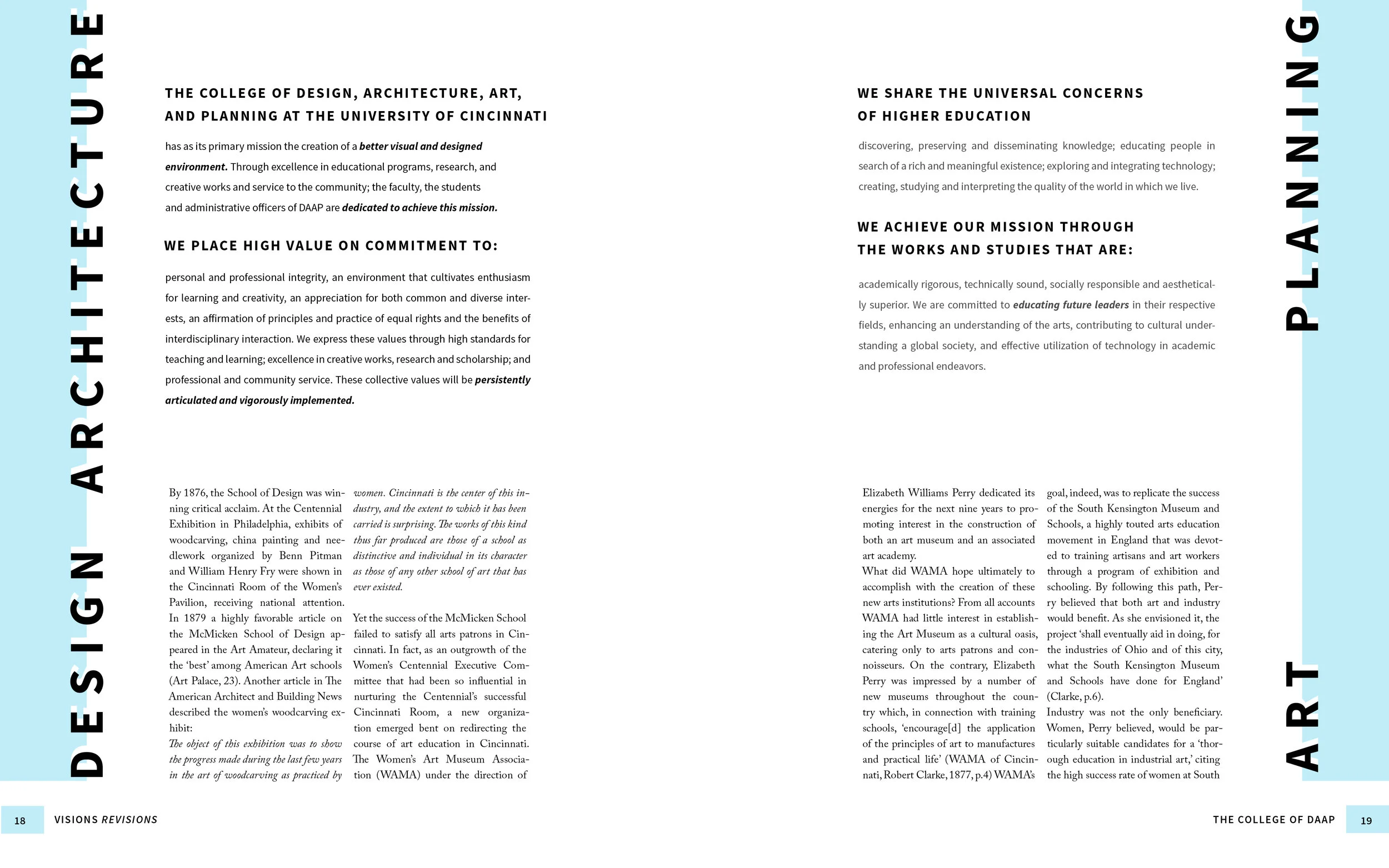
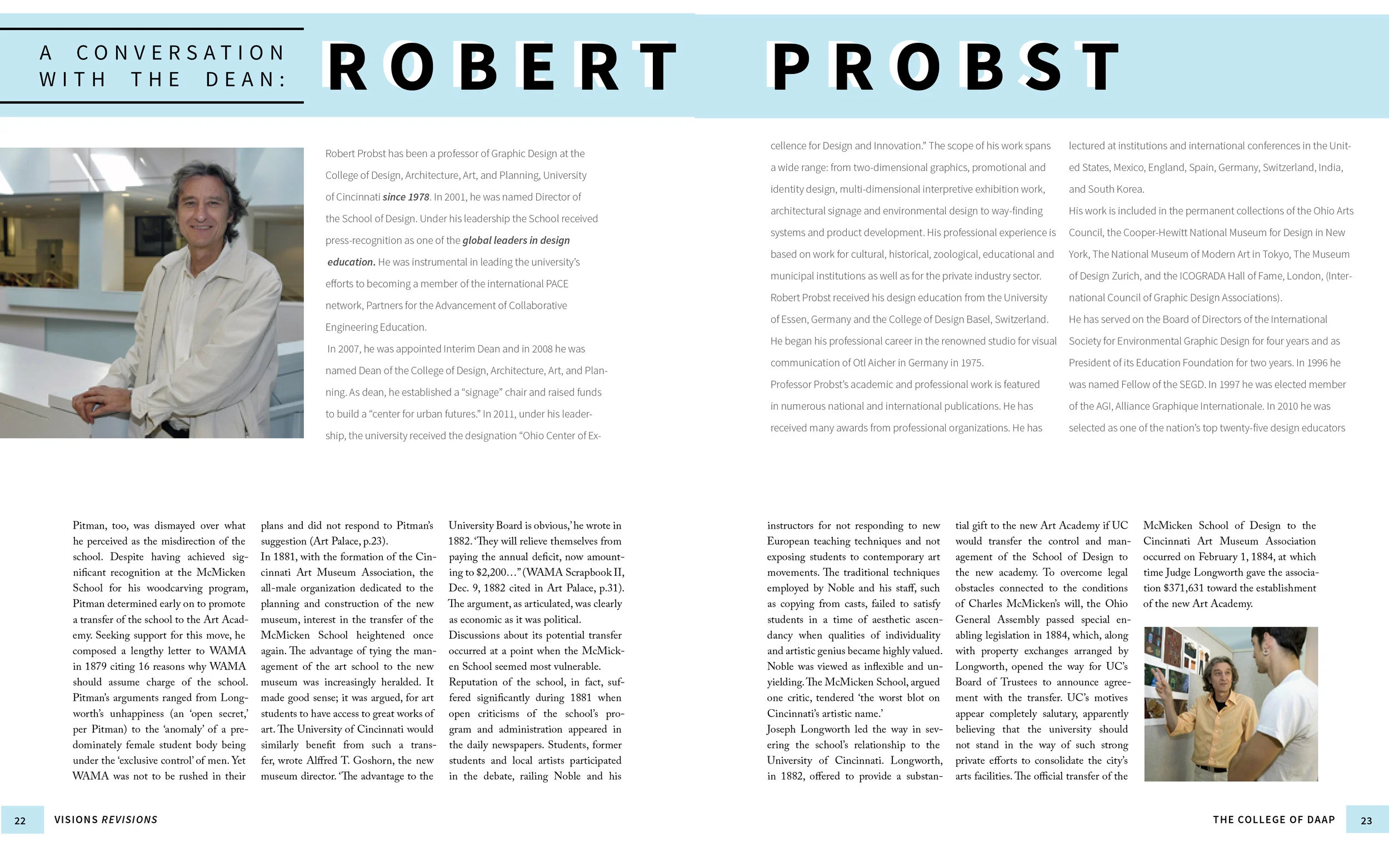
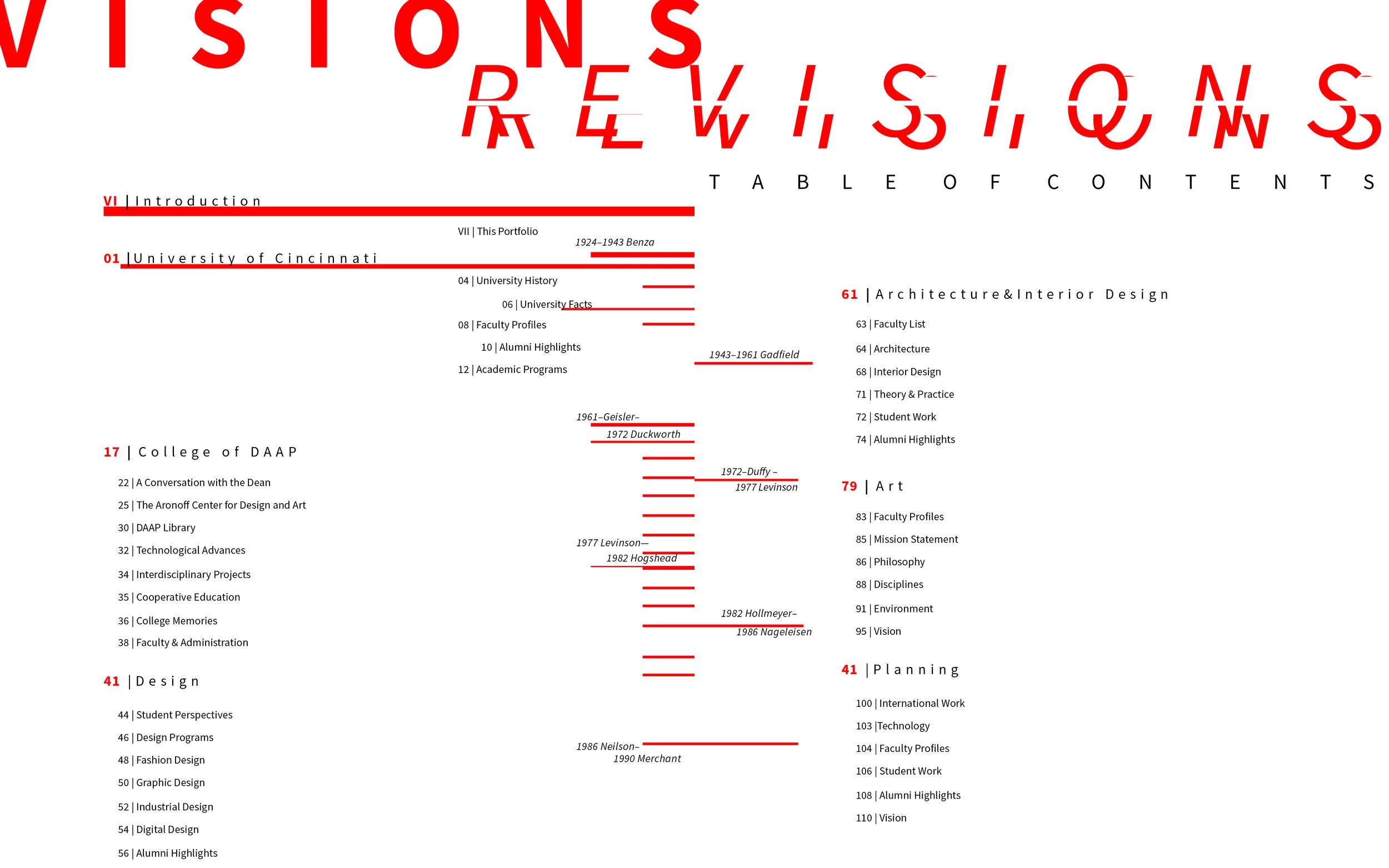
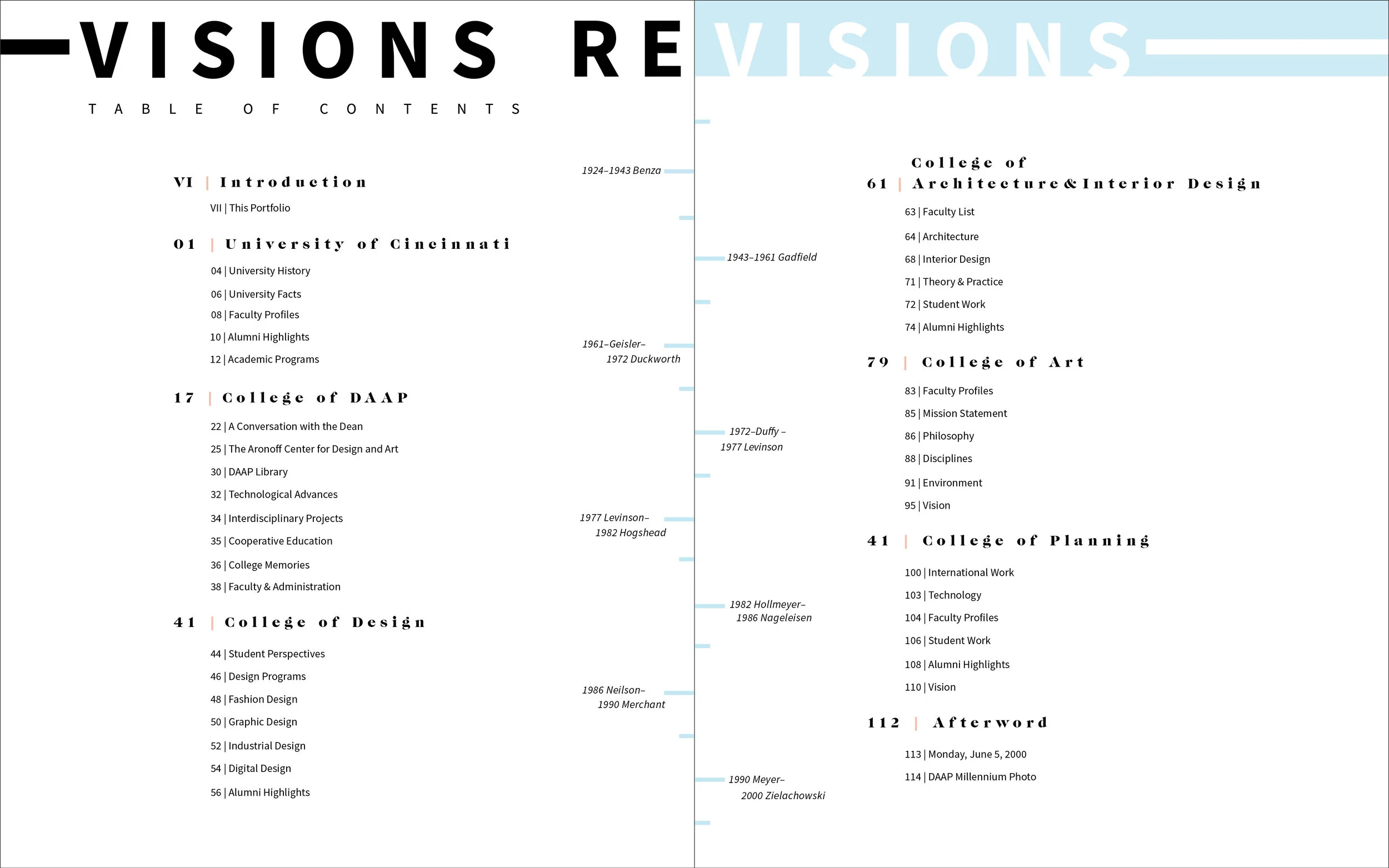
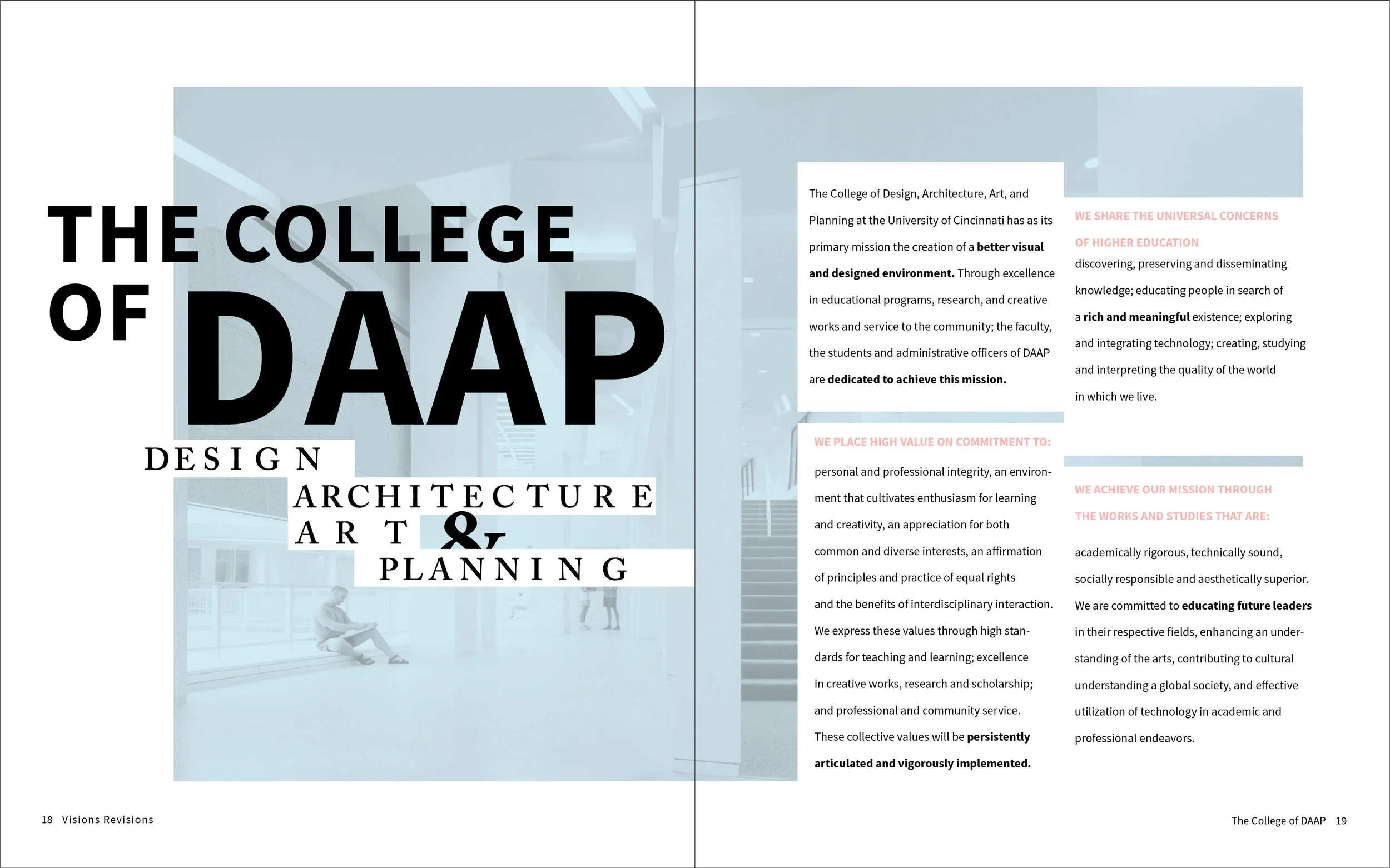
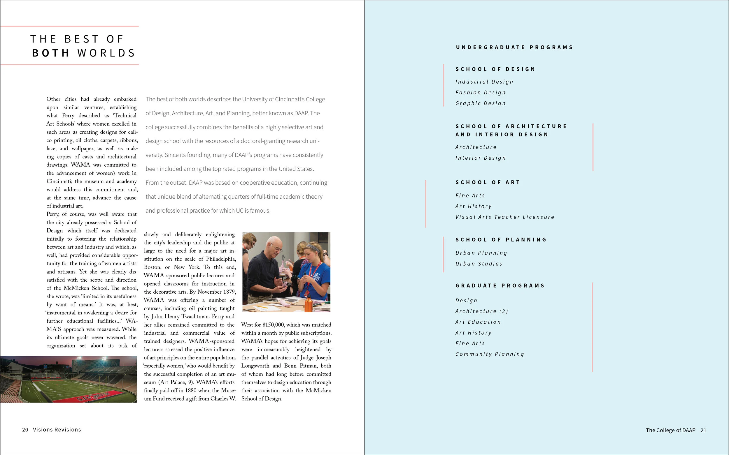
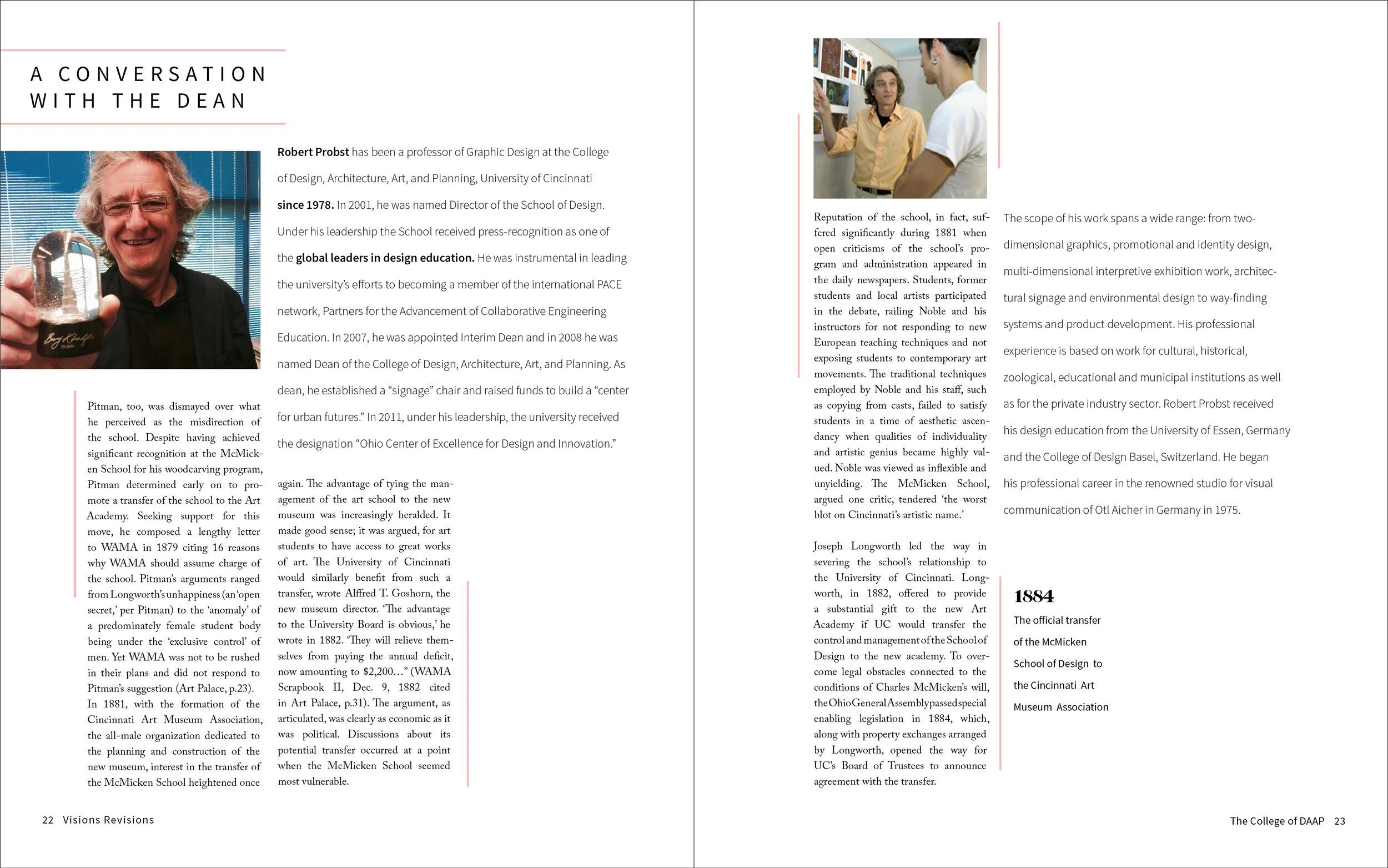
publication spreads
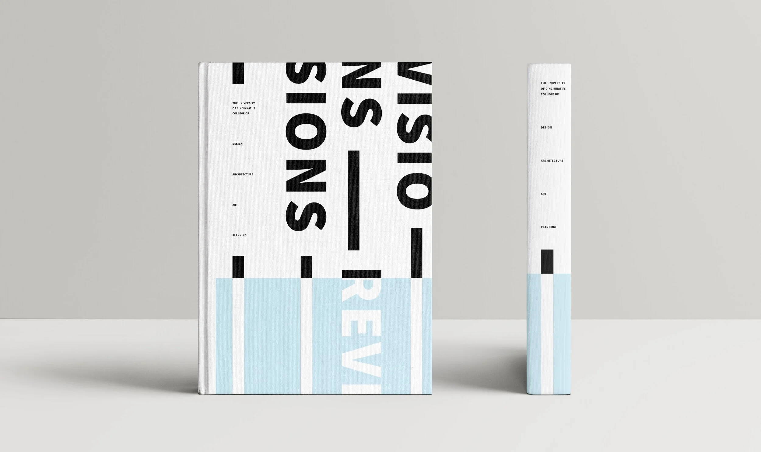
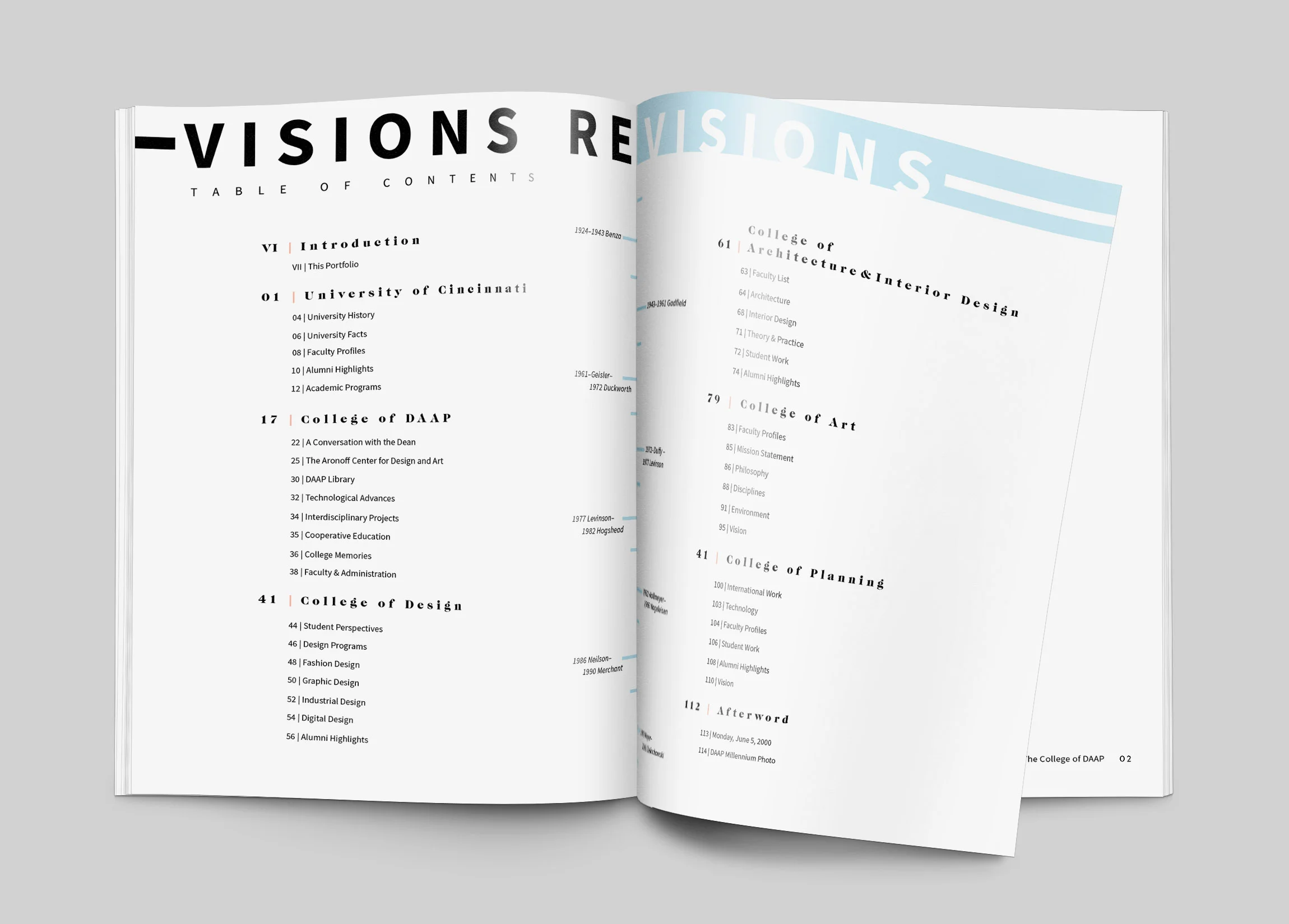
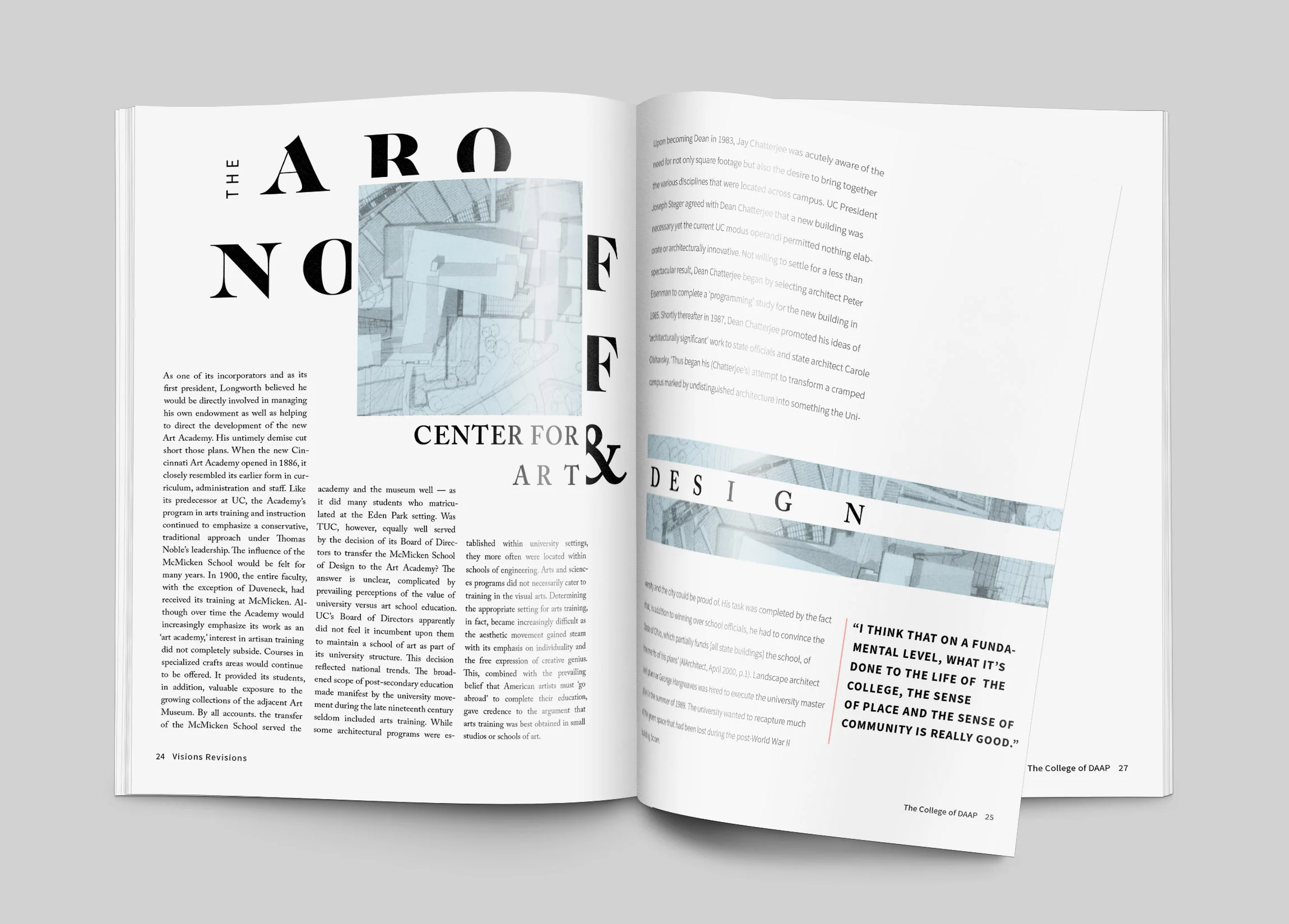
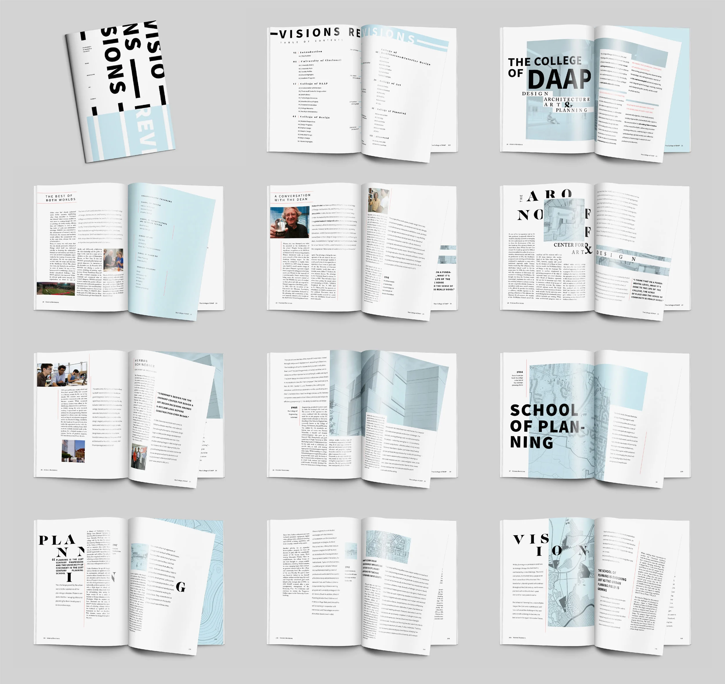
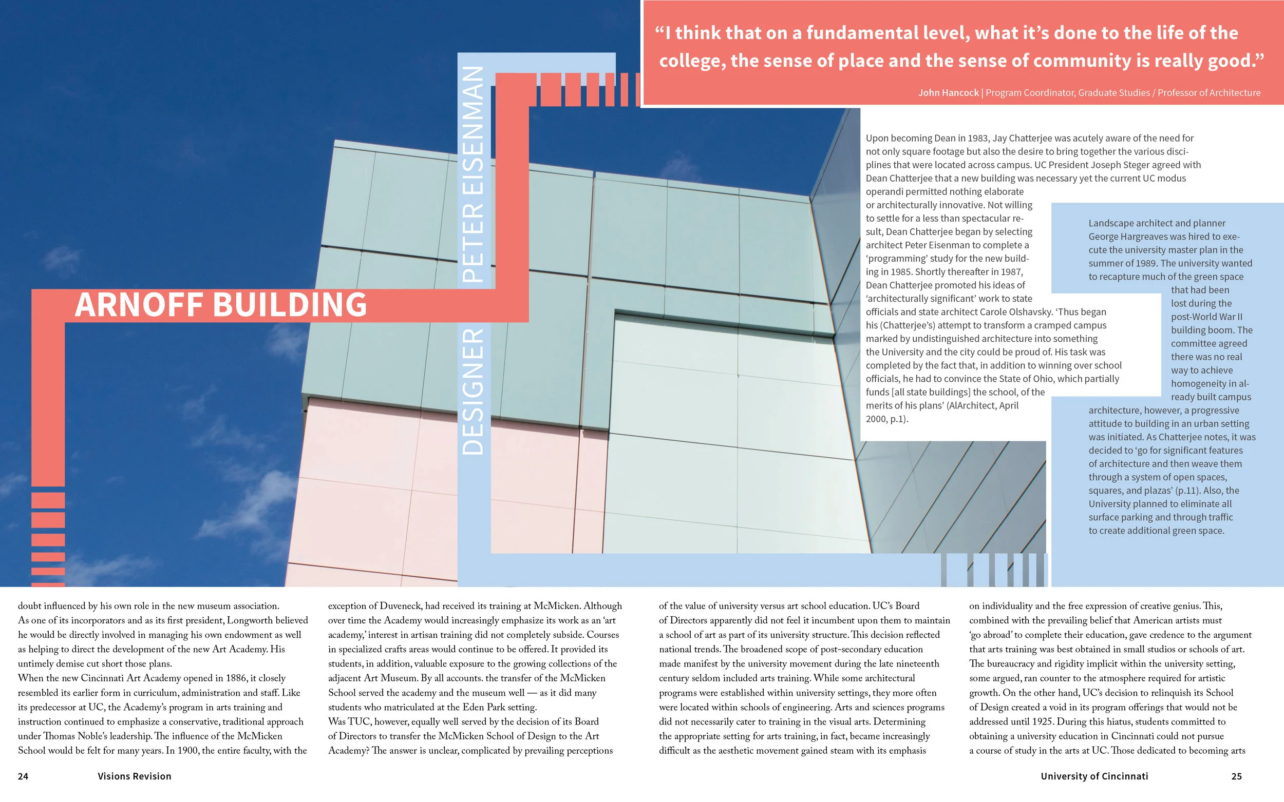
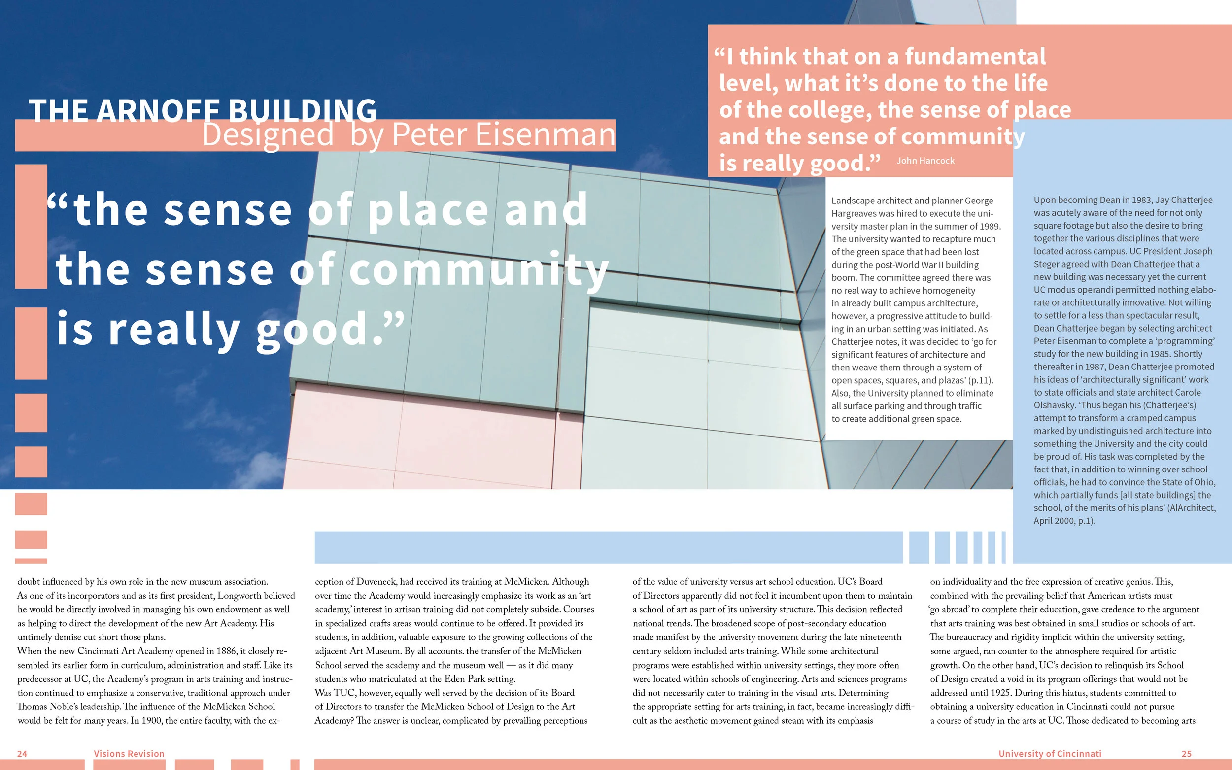
Final Publication Spreads
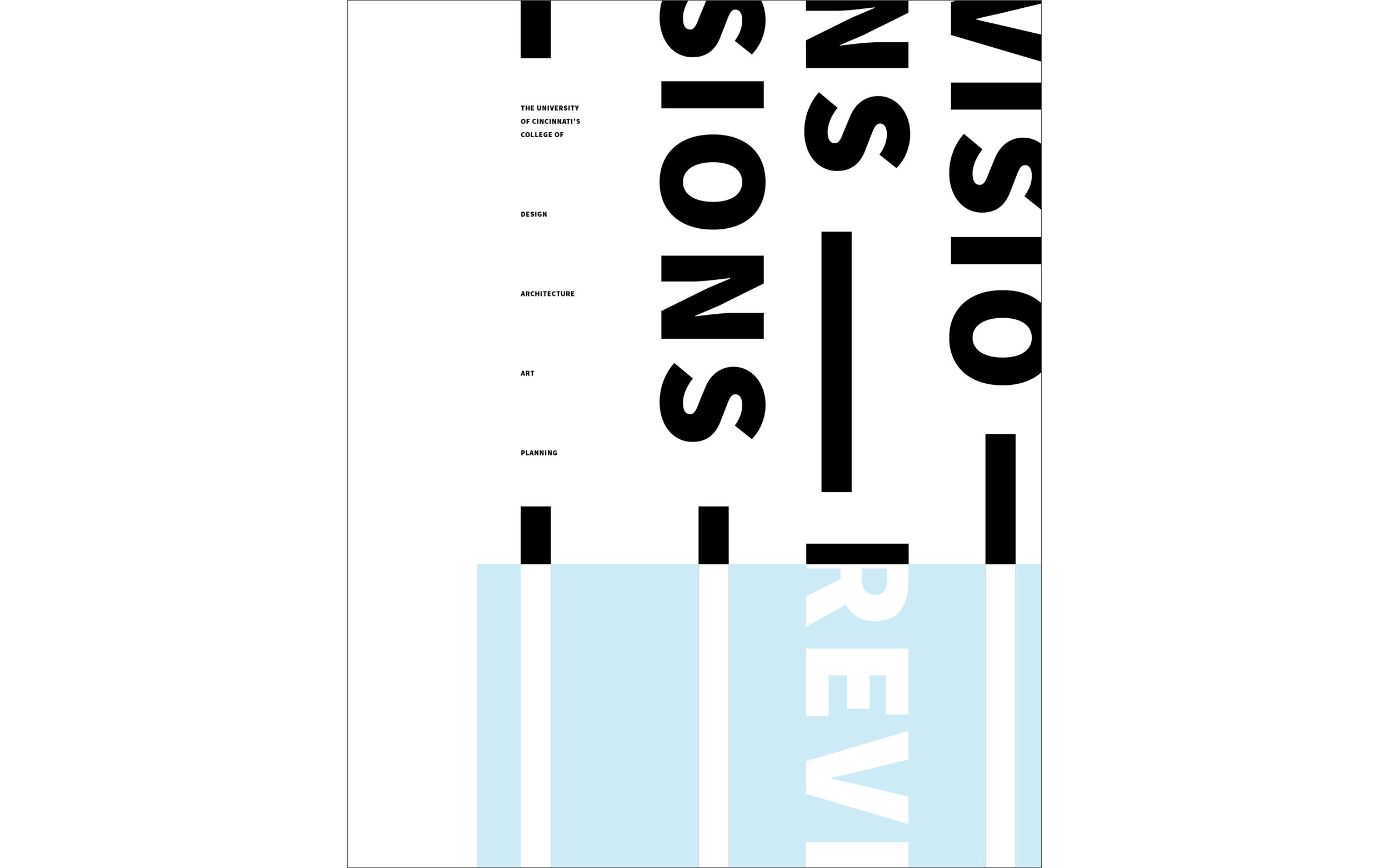
solution
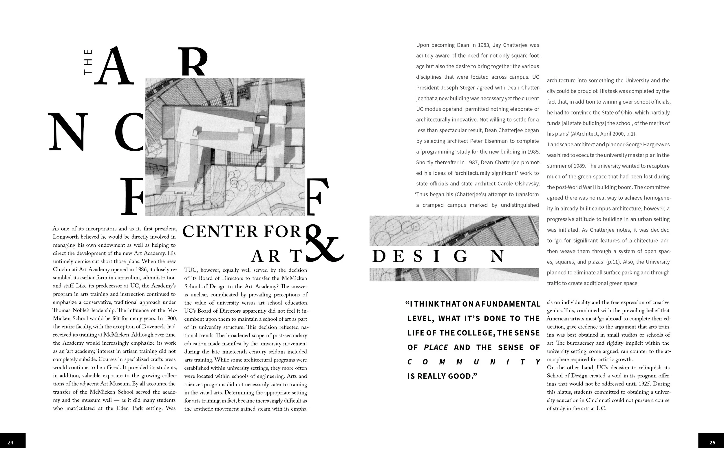
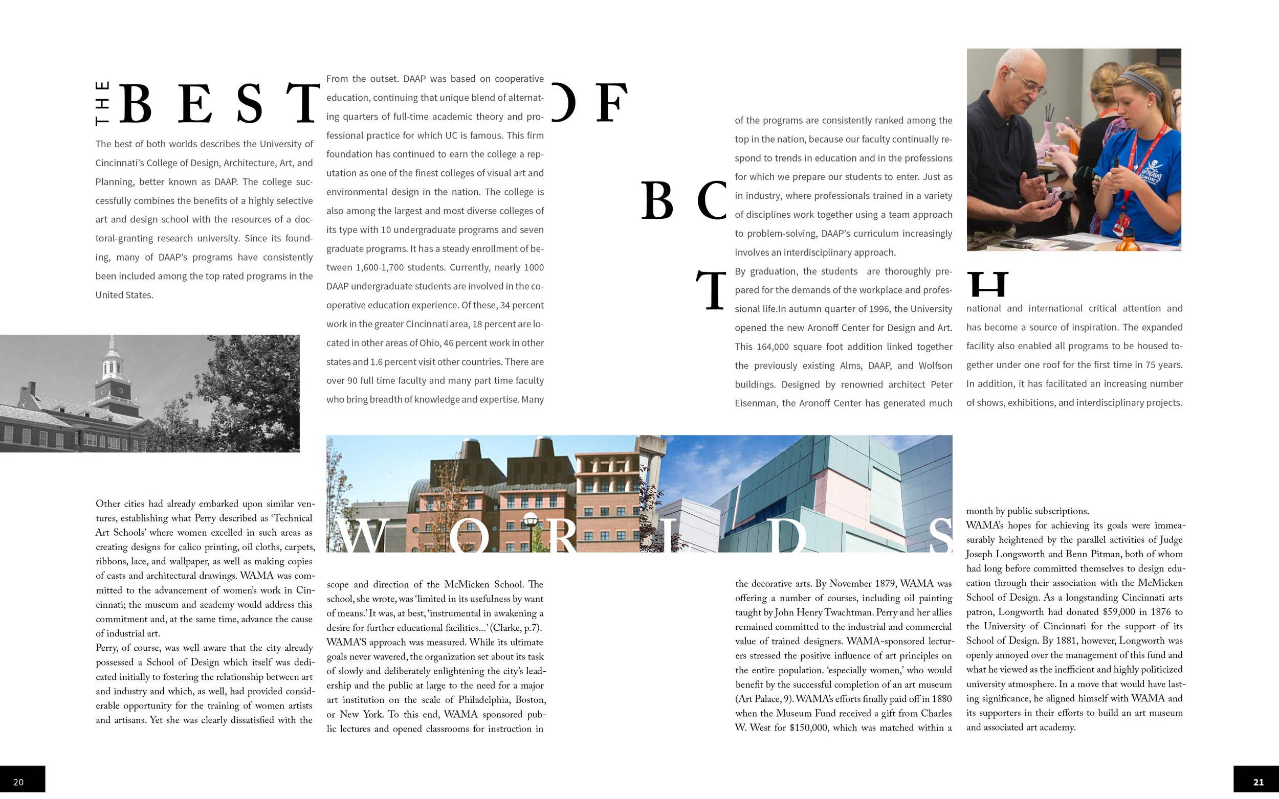
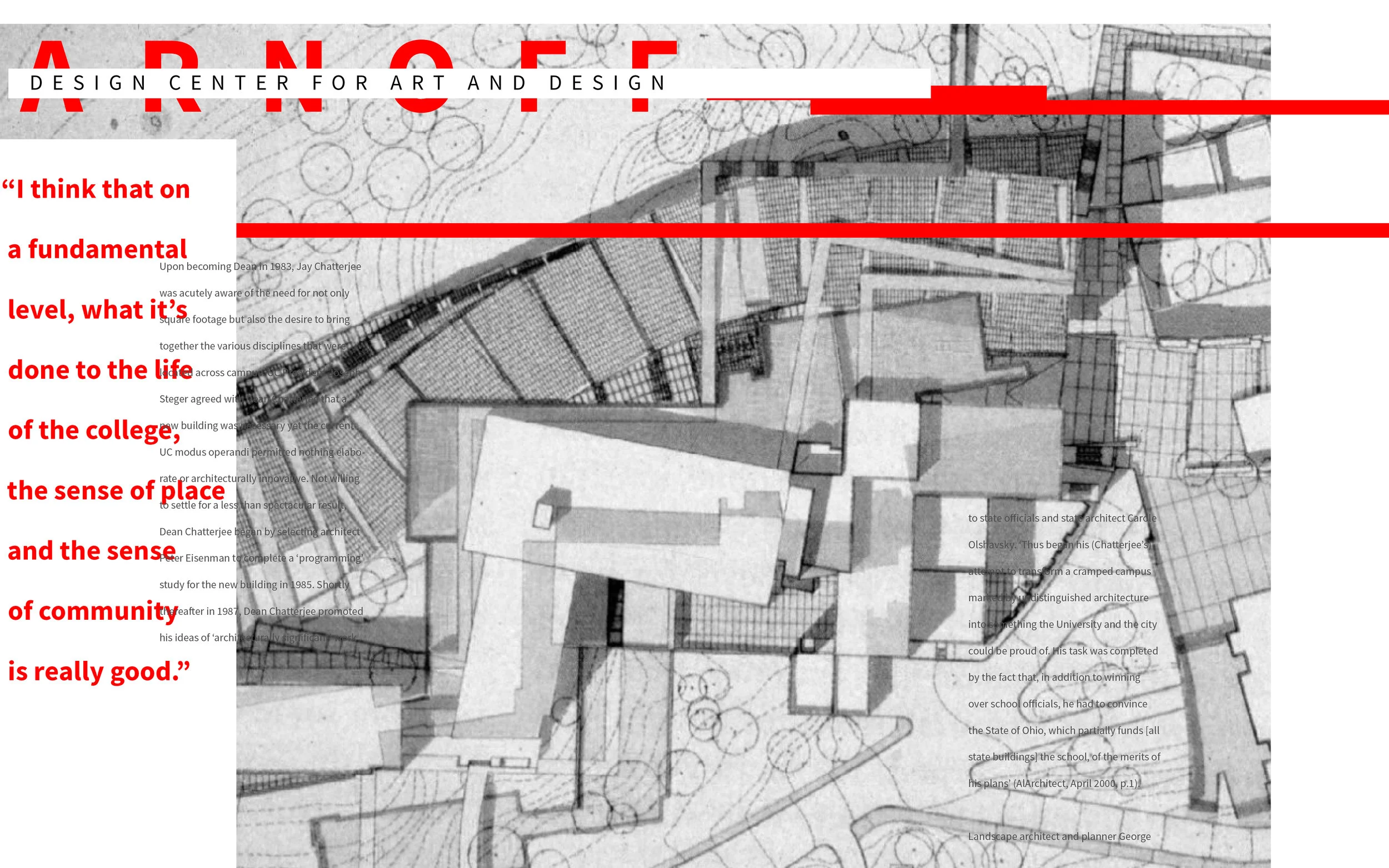
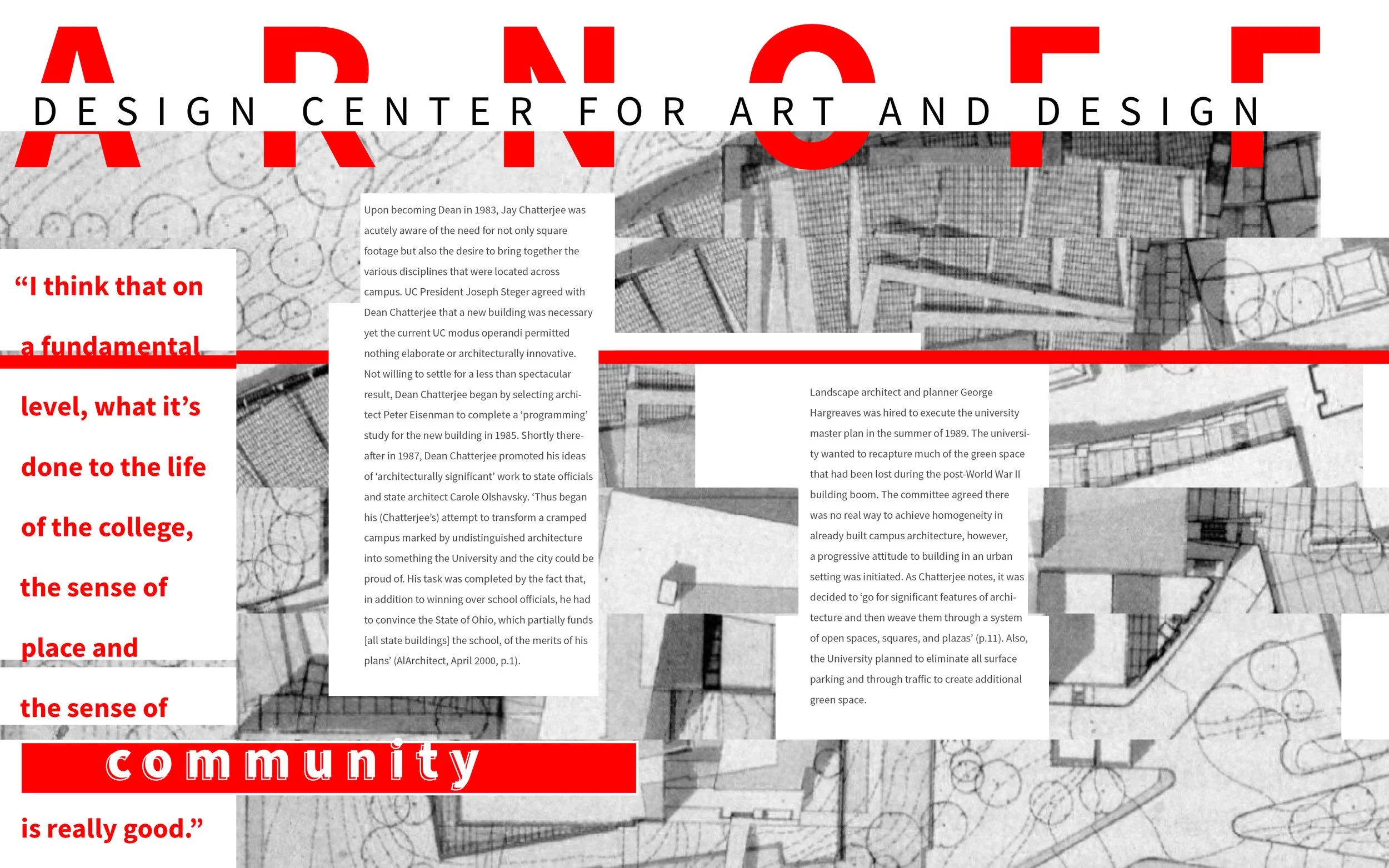
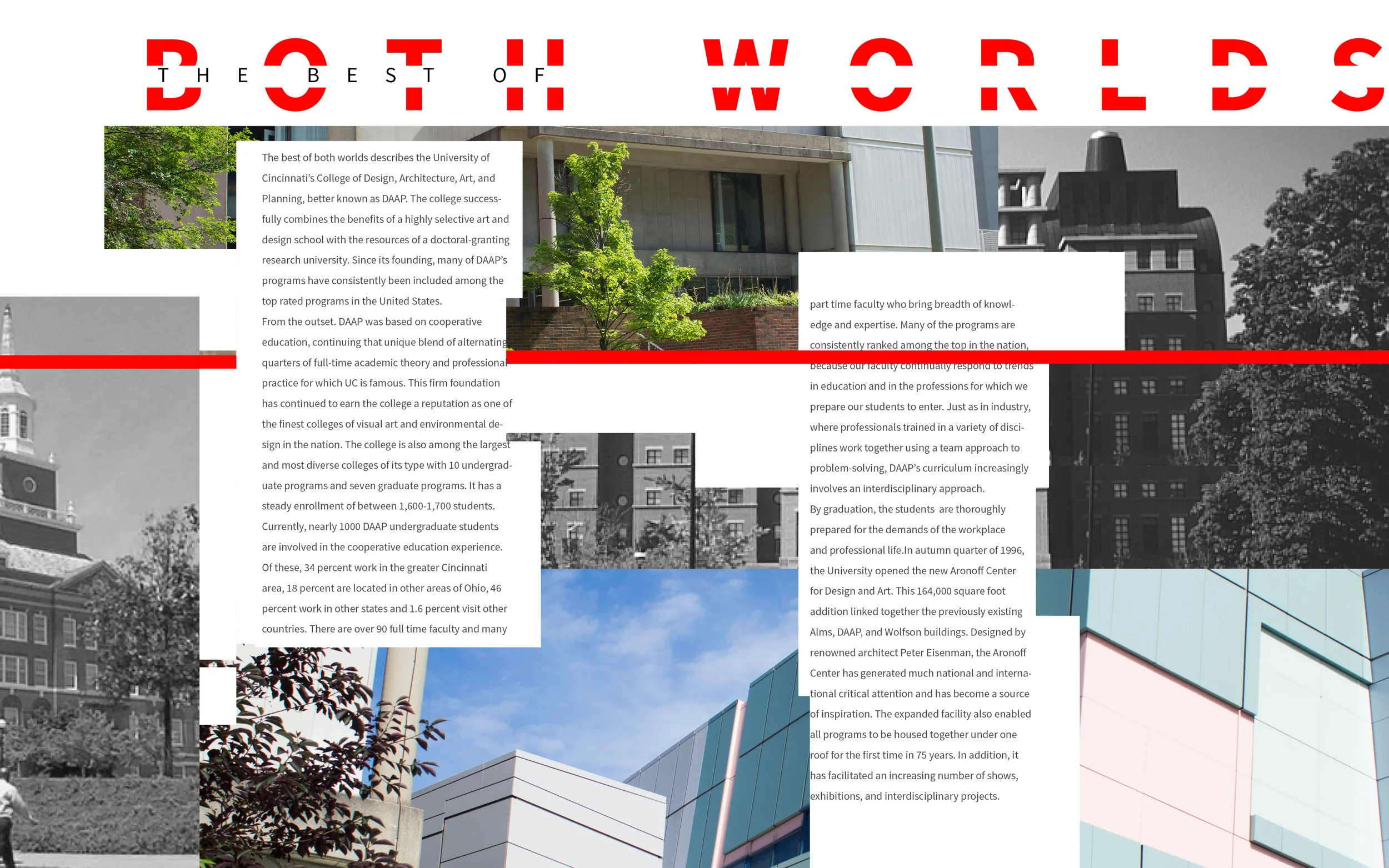
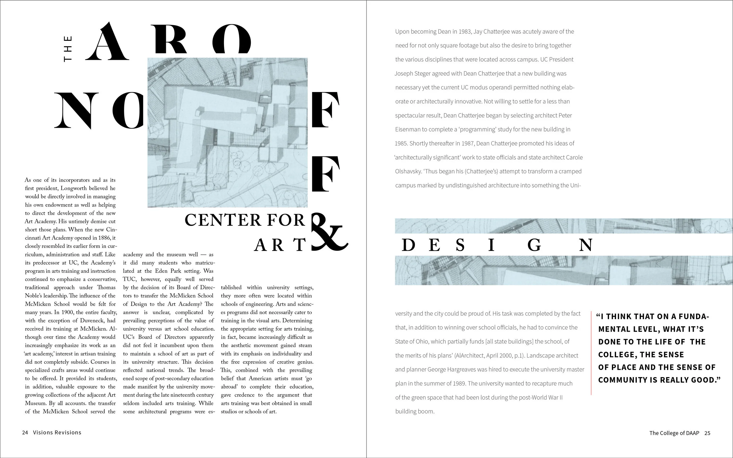
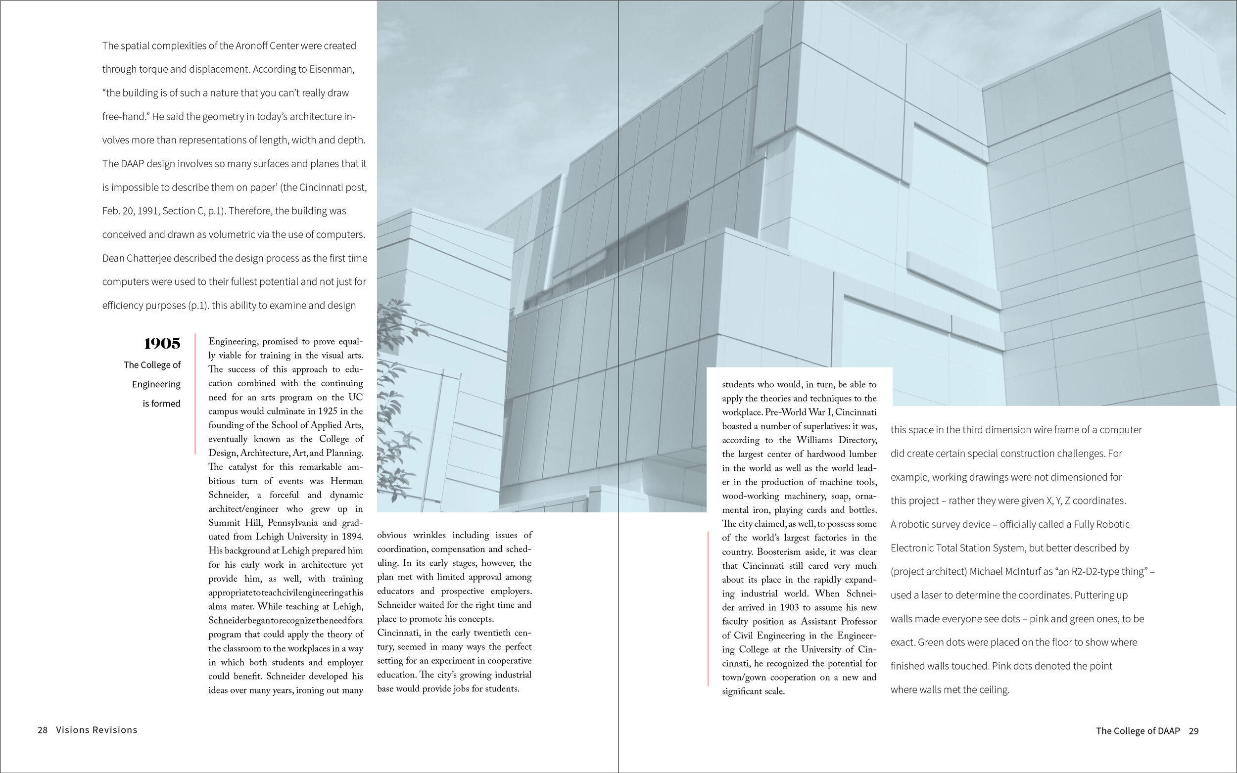
Experimental typography and photography demonstrate not only the unique characteristics of the DAAP building, but also the connections of past, current and future students.
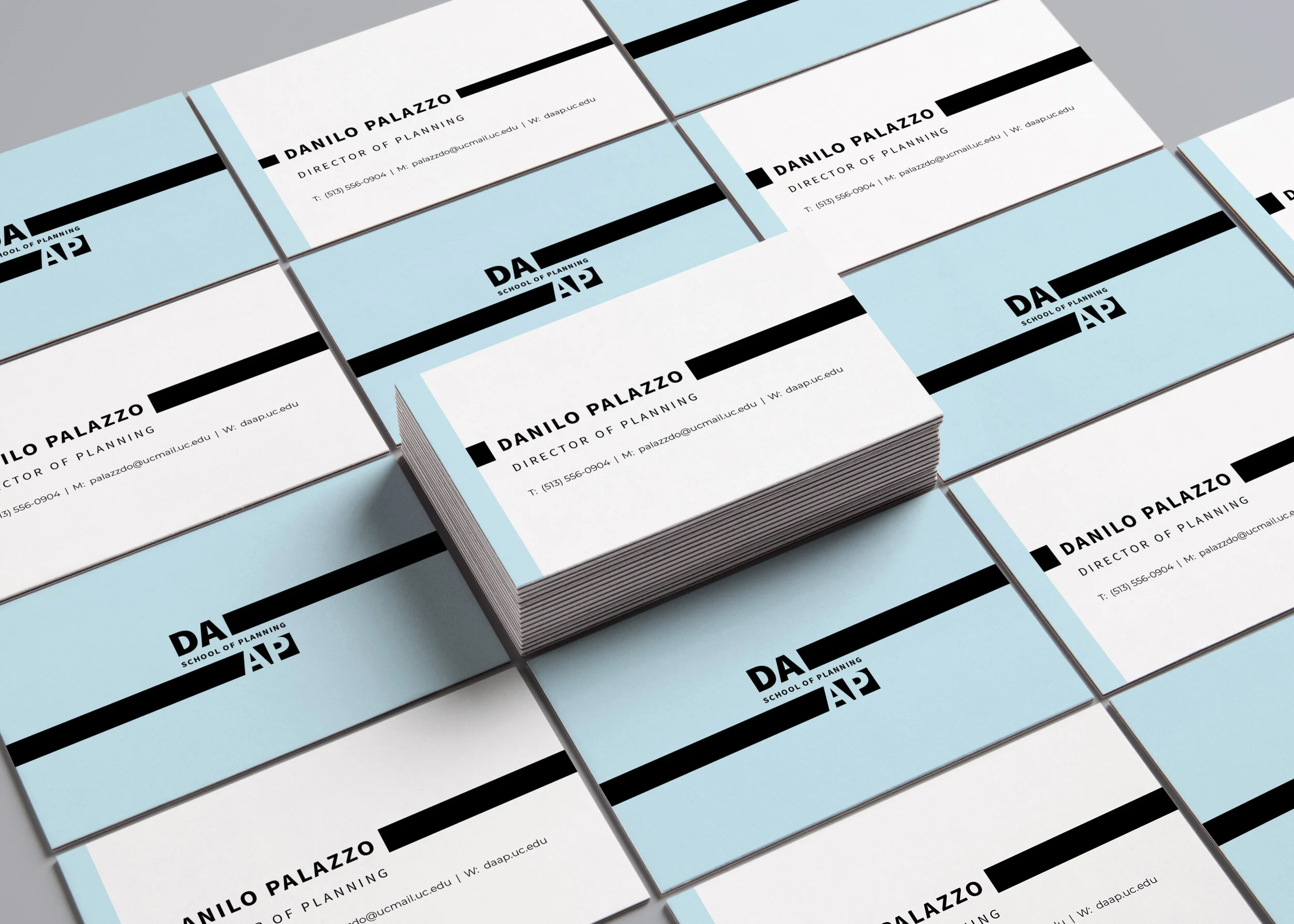
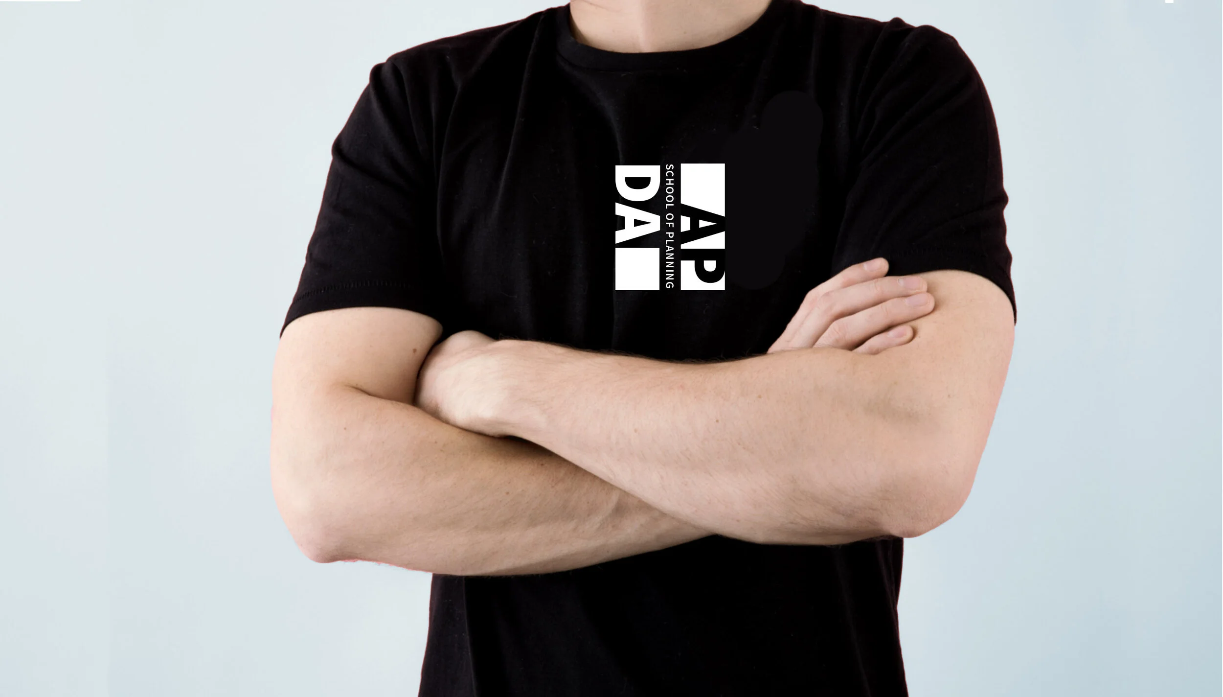
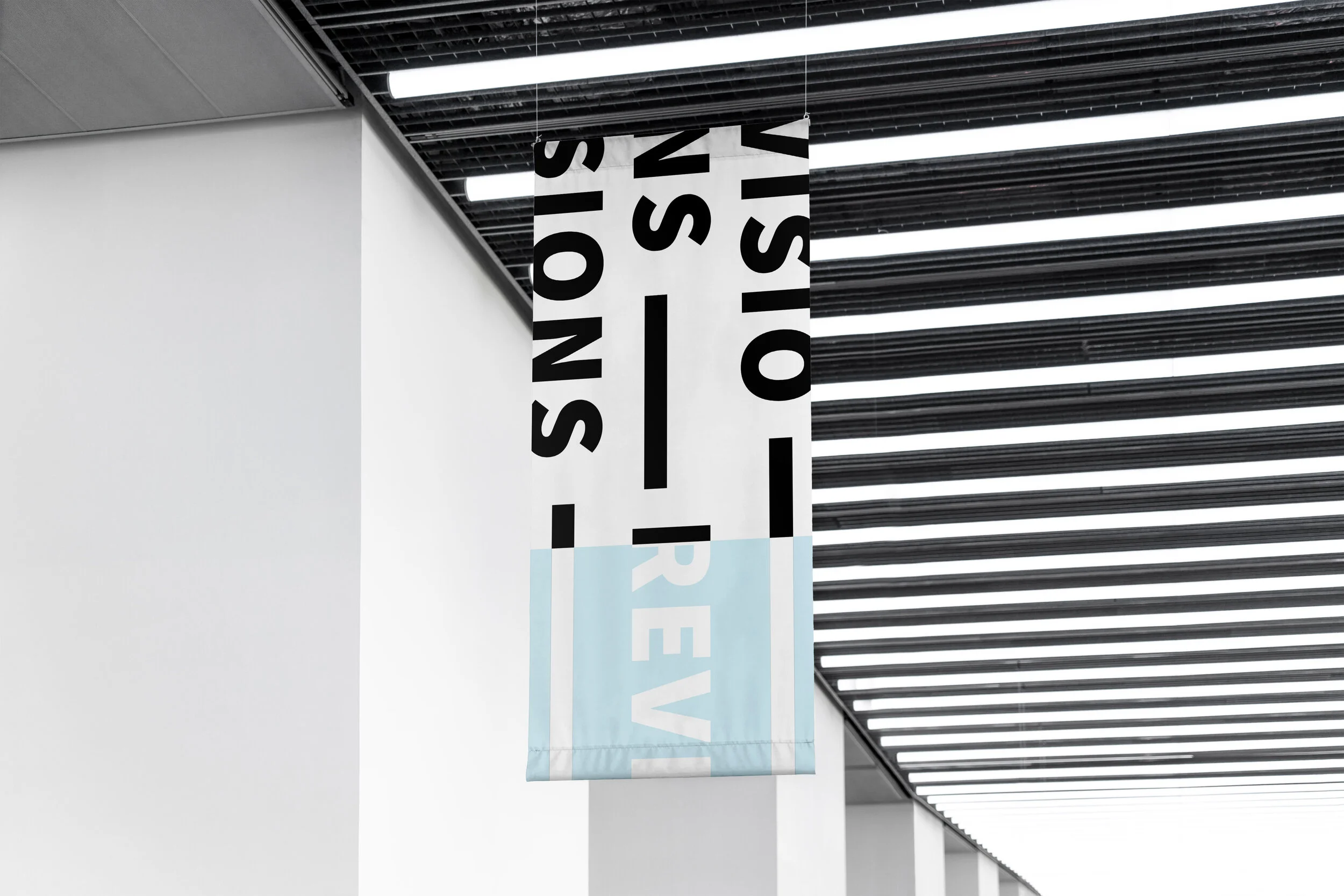
brand applications
Extending the system to demonstrate how it can be applied outside of the publication.
process
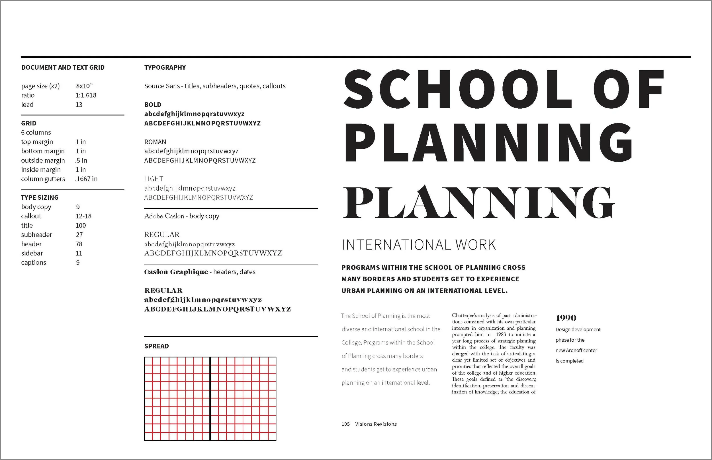
Final Publication Print Standards